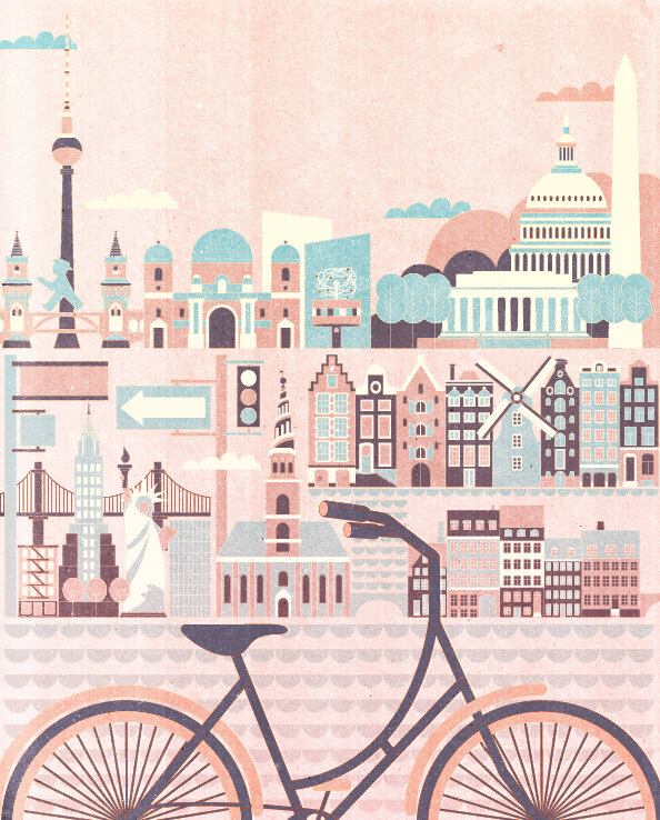
Illustration "Best Cities to Tour by Bicycle" includes New York, Washington DC, Amsterdam, Berlin, and Copenhagen. The story behind the illustration is that this piece initially was a client work (faded blueish background illustration for an article in AAA Traveler magazine), but ended up as a self-initiated further development and an art print which is available in my Society6 store as simple art print, framed one, or printed on stretched canvas.
 |
"Best Cities to Tour by Bicycle" available in my Society6 store as an art print, stretched canvas, and framed print.
©Kotryna Zukauskaite, 2014. Full portfolio at www.kata-illustration.com.
|
 |
| Shop this art print at SOCIETY6 |
 |
Amsterdam, color experiment.
©Kotryna Zukauskaite, 2014. Full portfolio at www.kata-illustration.com.
|
 |
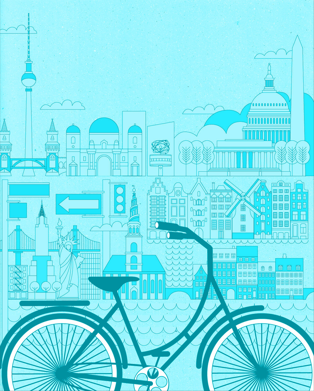
Original illustration - assigned by AAA Traveler magazine and art directed by Deanne O' Connor - as a background image for an article "Best Cities to Tour by Bicycle".
©Kotryna Zukauskaite, 2014. Full portfolio at www.kata-illustration.com.
|
-------------------------------------------------------------
Process images (also ©Kotryna Zukauskaite, 2014):
This illustration was drawn in vector line on top of a high res texture made of a scanned paper. Before actually starting to work on it, I've researched tons of photos and blueprints of buildings in particular cities. It took ages, as I needed a good front view without any trees or cars or other buildings in front of façades, but it made the actual process of illustrating much faster and enjoyable afterwards, because after the research I knew what I was doing, and all I had to do was sit down and make this happen.
Though you won't find may line-drawings in my portfolio, it became quite obvious very early in the process that in this scale, line was the only way to properly detail the whole thing. You may see above that it got very faded in the final stage and became a light neutral background for an article rather than an editorial illustration, but these process images will show you a level of detail and the amount of work put into this project, that led me into developing a colorful art print afterwards:
 |
| Line drawing on top of a textured background, moving things around, adding and removing buildings, trying to find some balance in the composition. ©Kotryna Zukauskaite, 2014. Full portfolio at www.kata-illustration.com. |
 |
| Still in a pure vector on textured background, before applying texture to the bicycle
©Kotryna Zukauskaite, 2014. Full portfolio at www.kata-illustration.com.
|
 |
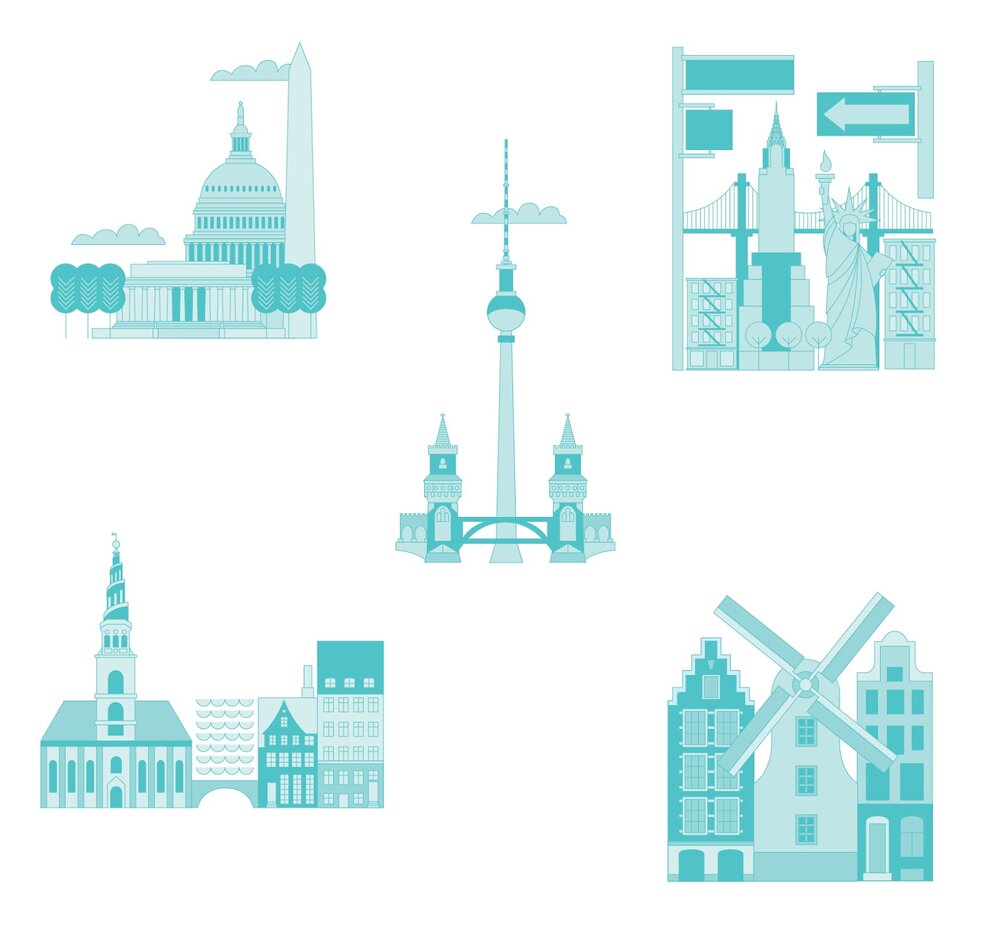
| Little spot pieces on white background, that I'm still thinking of animating.
©Kotryna Zukauskaite, 2014. Full portfolio at www.kata-illustration.com.
|
