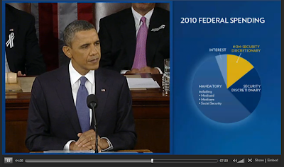
Everyone who knows me personally knows that I am a geek of politics, and a geek of info graphics. So I just had a Christmas Morning moment when watching a video of The State of The Union speech by president Obama at www.whitehouse.gov/state-of-the-union-2011 - with those little PIE CHARTS and other data changing according to the part of the speech! Great way to sum up main issues for those who tend to loose attention during an hour-long speeches interrupted by applauses each minute or so.
Great stuff for those like me who work in visual industry (and wishes to do more editorial illustration on politics), is addicted to listening long interviews or long speeches on important issues from different fields of life, and LOVES info-graphics. Happy times. Oh and that Salmon chart was just beyond my highest expectations!

Great stuff for those like me who work in visual industry (and wishes to do more editorial illustration on politics), is addicted to listening long interviews or long speeches on important issues from different fields of life, and LOVES info-graphics. Happy times. Oh and that Salmon chart was just beyond my highest expectations!


