Oi chaps,
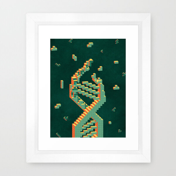
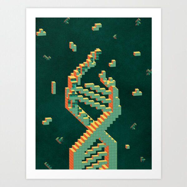
though this never got published, and is a bit beyond my "individual style" (no textures!), I was very happy to work with best minds in contemporary bio-chemistry / gene engineering directly (which doesn't happen too often).
Two color options: blue one stands for "technology", green one for "biology", and the whole concept of the seahorse was dictated by some scientist-slang. Empty space was designed for a specific layout full of titles, and other cover elements.
There was a lot of effort from all sides put into this project and though it never got published because of many reasons beyond control of the team I've worked with, I'm still a closeted geek, so this was fun anyway.
©Kotryna Zukauskaite, 2015, more at
www.kata-illustration.com


